


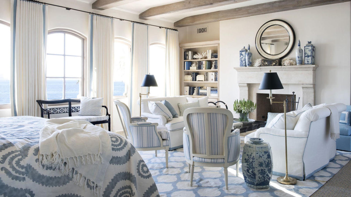
A beginner's guide to not overthinking blue.
The paint aisle is designed to make you panic. Forty nearly identical whites. Blues named after weather. A chip that looks perfect under fluorescent light and turns gray in your hallway. This notebook is the antidote: a short method, a short list of colors, and permission to stop shopping once the room feels calm.
Coastal color is not a scavenger hunt for the perfect blue. It is a ratio. Neutral first. One blue that means it. A little warmth so the house does not feel like a dentist’s office by the sea.
1. Decide the climate, not the chip
Before you fall in love with a blue, decide which coastal temperature you actually live in.
New England coastal is navy, white, and weathered gray — crisp and a little preppy. Soft coastal is powder blue, seafoam, and sandy beige — quieter, more linen than flag. Mediterranean coastal is plaster white, terracotta, and olive, with blue only as a pot or a tile. Tropical coastal is brighter: coral, leaf green, a swimming-pool turquoise used sparingly.
You do not have to pick a region like a costume. You do have to pick a temperature. Mixing a terracotta wall with a navy sofa and a seafoam rug is how rooms start arguing with themselves.

A 1920s Nantucket cottage facing the water. Apricot walls, a cream sofa, and the view as the cool note — climate first, chip second.
2. The neutral is the star. Blue is the guest.
Beginners paint a wall blue and then wonder why the room feels smaller and colder. In a coastal house the walls, the large sofa, and the floors should be the quiet colors: a warm white, a greige, a pale sand. That envelope is what makes the blue look expensive when it finally arrives.
Reliable starting walls:
-
Benjamin Moore Chantilly Lace or Simply White — clean, not sterile, if your light is warm
-
Benjamin Moore Pale Oak or Edgecomb Gray — greige that behaves like sand
-
Sherwin-Williams Alabaster or Creamy — off-whites that glow at night
-
Sherwin-Williams Sea Salt — the rare “neutral” that is already a little coastal on its own

An East Hampton bedroom where the envelope does the decorating: paneled white, a weathered headboard, gray only in the bedding.
3. Memorize 60-30-10 and then stop doing math
Sixty percent of the room is the dominant neutral: walls, large furniture, flooring. Thirty percent is the supporting color — usually your hero blue — on a sofa, a painted island, a large rug, or an upholstered headboard. Ten percent is the accent: coral, straw, a deeper navy, a green plant, a wood bowl.
If you can point to the sixty, the thirty, and the ten in a photograph of your room, the palette is working. If you cannot, you have too many colors or they are all the same volume.

White slipcover as the 60, blue-and-white pattern as the 30, a single ginger jar as the 10. Real furniture, real light.
4. Pick ONE hero blue and give it a job
The classic beginner mistake is five blues that almost match. The room looks busy and oddly cheap. Choose one blue and let everything else be a lighter or darker version of that same family — or stay neutral.
Four heroes that behave well in real houses:
-
Benjamin Moore Palladian Blue — muted, a little green, hard to hate
-
Sherwin-Williams Sea Salt or Rainwashed — spa blues that love bathrooms and bedrooms
-
Sherwin-Williams Naval or Benjamin Moore Hale Navy — the Hamptons sofa / island blue
-
A powder or hydrangea blue in fabric, not paint, if you are nervous
Give the hero a job: the island, the sofa, the guest-room walls, the dining chairs. Do not give it every job.

A Nantucket kitchen: pale gray cabinetry, rush-seat chairs painted one decisive blue. The hero has a job. Everything else stays quiet.
5. Put color where you can change your mind
Walls and built-ins are expensive to undo. Pillows, stools, a runner, a lampshade, even a painted island (if you already own the cabinets) are not. For a first coastal palette:
-
Walls and big upholstery: stay in the neutral family
-
The 30 percent: a sofa, a rug, an island, or dining chairs — pick one
-
The 10 percent: coral or straw pillows, a wood bowl, green in a pot, one navy book spine
If the blue is wrong, you are returning a pillow, not hiring a painter again.

Steven Gambrel in the Hamptons: pale millwork, a single teal banquette, a blue door. Color on the pieces you could repaint.
6. Sea Salt and friends: when the wall can be the blue
There is an exception to “don’t paint the walls blue.” Soft blue-greens with a high light reflectance — Sea Salt, Palladian Blue, a washed aqua — can be the envelope in a bedroom or bath if the rest of the room stays white, oak, and linen. They read as air, not as a statement. Deep navy walls are a different sport; save them for a powder room or a library.

The exception that proves the rule: a Hamptons living room washed in one soft blue. White trim and warm wood keep it air, not theme.
7. Add warmth on purpose
An all-cool scheme — white, gray, and blue — photographs like a catalog and lives like a waiting room. Coastal rooms need a warm note: unlacquered brass, honey oak, a terracotta pot, a coral pillow, a straw lamp. You do not need all of those. You need one.
If the room feels chilly after you add the blue, do not buy a fourth blue. Buy something the color of late-afternoon sand.
8. Test like a skeptic
A chip lies. Paint a poster board, not a two-inch square, and lean it in three places: on the sunniest wall, in the darkest corner, and opposite the window. Look at it at 8 a.m., noon, and after the lamps are on. If it goes gray or green in the corner, that is the real color. Believe the corner.
Also test the hero fabric next to the wall paint. Blues that look related in a store can look like two different weather systems at home.
9. The traps, so you can walk around them
-
Too many blues. If you cannot name the one hero, you have too many.
-
A dark, saturated wall in a small, north-facing room. Coastal needs bounce.
-
Matching every accessory to the same chip. Tonal, not identical.
-
Skipping wood and brass. Cool palettes need a warm object.
-
Choosing the blue first. Choose the white in your actual light, then the blue.
10. A one-afternoon palette you can live with
If you want the shortest possible version: paint the walls Alabaster or Pale Oak. Put a navy or hydrangea-blue thing on the largest seat or the island. Add a jute rug and one warm object. Do not buy another color for thirty days.
You do not need the perfect blue. You need a quiet envelope, one blue with a job, and the nerve to stop.
When the lights are off and the room still feels like air, the palette is finished. Everything after that is shopping.
Stop in the paint aisle. The house already knows.


